Case Study: iampickledtink

Madi Balman
Hi! My name is Madi Balman, Founder and Creative Director of Skellydog – a branding focused marketing agency that has earned top-rated recognition for several years. I am happy to present a new series of case studies depicting some of our projects, the challenges we faced, and what the results of their project were! In this case study, we go over a project for a close friend of mine – iampickledtink.

Client Profile:
Iampickledtink is the handmade ceramics brand of ceramicist Meg Slappey. Meg is a personal friend, and I was ecstatic when she entrusted me with her rebrand in 2022.
Project Details:
When Meg approached me, her ceramics brand was due for an updated logo suite. As a handmade artist, Meg needed her branding to feel unique, creative, and less buttoned-up than the typical brand logo. As a former brand designer herself, Meg had an eye for design and knew what she wanted–so I knew that crafting the perfect visual brand would test the efficacy of my processes.
Meg’s brand name, ‘Iampickledtink,’ was inspired by her favorite Crayola crayon name: Tickle Me Pink. So, as you can guess, a light pink was non-negotiable in her branding. Her art style is feminine, with a ‘cottagecore’ aesthetic–full of mushrooms, wood, and forest vibes. People call Meg a ‘fae,’ or ‘fairy,’ and with the aesthetic of her work, I wanted to incorporate that fairy vibe into the brand as well.

Project Challenges:
If you’re familiar with my work, you know that I live in the bold–I love to work with bright, ‘loud’ brand identities. So using a ‘dainty,’ soft color palette was, in itself, a challenge. Couple that with finding the perfect aesthetic for a fellow design nerd, and you have a formidable project.
Creating Success
In many branding projects, success requires dialing back my creativity to ensure I’m meeting the needs of the business. But in this project, I needed to let myself be creative.
Since Meg is a friend, she wanted me to take complete creative control over everything–I was able to go all-in on the process.
I used Pinterest to find references that ultimately guided me in developing the style, imagery, and color palette. When I finally leaned into my creativity, what emerged was a brand that felt carefully crafted to Meg’s brand and personality.
The Toolkit:
This project was proof that having solid processes allows creativity to shine.
My typical branding process looks like this:
- Research: using font-finding platforms, Pinterest, moodboards created by the client, etc.
- Development: create a set number of concepts (based on the package the client chooses).
- Revision: make measured changes based on client feedback (color changes, font changes, etc).
- Delivery: deliver finalized files via Google Drive in all needed formats.
In order for this process to work, I had to call on all of the knowledge and skills I gained over my years of education and career experience. But when the process is followed, it works!

The Outcome:
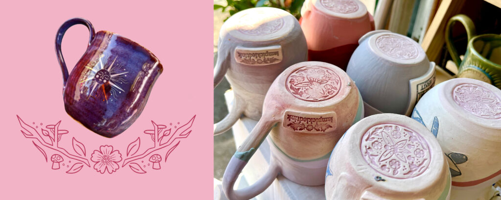
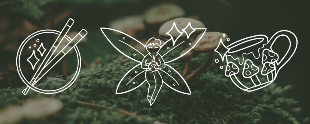
We landed on a brand identity built on a foundation of custom, hand-drawn elements–including a fairy, mushrooms, and florals. The primary color was, of course, a light pink. Meg was giddy with the resulting brand suite. She applied the new branding throughout her business. She added custom stamps on the bottom of her mugs, and created beautiful collateral, including business cards, that she could use for in-person networking and events!
This project allowed me to step outside of my comfort zone and push the boundaries of my creativity, ultimately providing a product that the client loved. I adapted my design style to a totally new aesthetic, proving to myself that I could take on clients even in industries I’m less familiar with. I got to know my own processes in new ways, which helped me to eventually tailor them toward an easier, more streamlined experience for my clients. I was proud to create a beautiful hand-drawn branding suite for a handmade business–and I look forward to helping more fellow creatives in the future!
If you are a handmade business interested in working with Skellydog, reach out! We offer an exclusive discount for handmade businesses and can help you across all your packaging and collateral needs. This includes but is not limited to custom thank you cards, custom packing tape, custom stickers or freebies, etc.